Design Principles are the guidelines that allow us to make our designs clear and easy to understand.
Whether you’re designing a business card or a billboard, a web site or a mobile app, great visuals don’t happen by accident. They follow a set of “rules” that help organize information and please the eye.
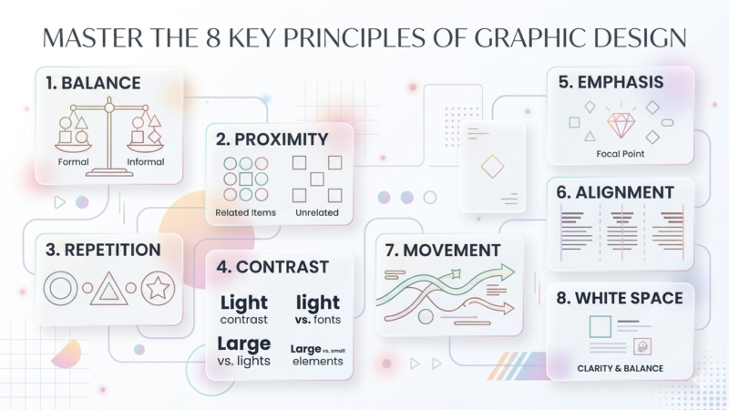
Here are the 8 key principles of graphic design you need to know:
Balance: This is the distribution of visual weight. You can achieve symmetry (even on both sides) or asymmetry (using different sized elements to create a felt equilibrium).
Proximity: Placing related items together creates a relationship. It reduces clutter and helps the viewer understand which pieces of information belong to each other.
Alignment: Nothing should be placed randomly. Every element should have a visual connection with something else on the page to create a sharp, ordered look.
Repetition: Using the same colors, fonts, or shapes throughout a piece creates consistency and strengthens the overall brand identity.
Contrast: This happens when two elements are different (like black vs. white or thick vs. thin). It’s the best way to make a design pop and prevent it from looking flat.
Whitespace: Also known as “negative space,” this is the empty area around your subjects. It gives the design room to breathe and prevents the viewer from feeling overwhelmed.
Hierarchy: This is the order in which the viewer perceives information. By using different sizes or bold fonts, you signal which part of the message is the most important.
Emphasis: The finishing touch. This is the focal point of your design—the one specific part you want the audience to see first before they look at anything else.
Mastering these basics will instantly take your work from “DIY” to professional.